05
BMG Columbia House, Inc.
Client: BMG Columbia House, Inc.
Client: BMG Columbia House, Inc.

Overview
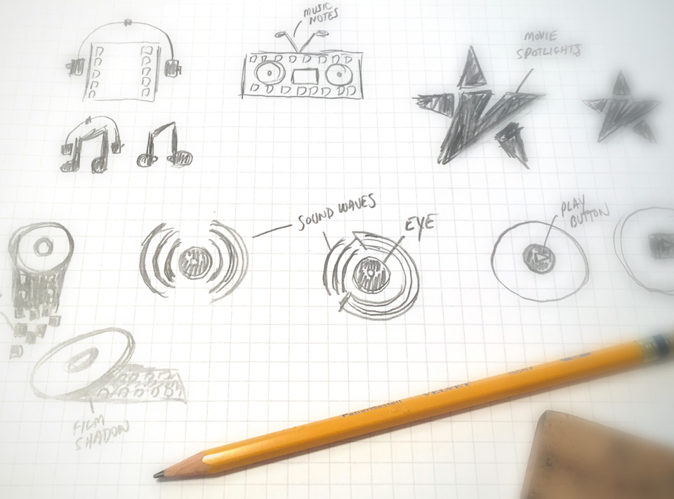
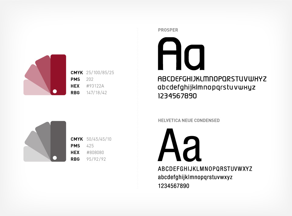
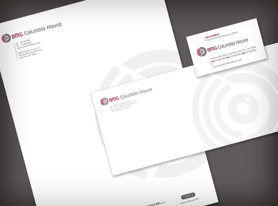
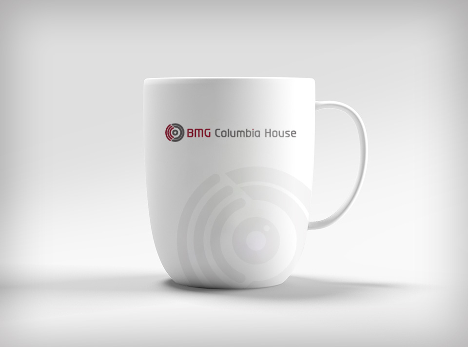
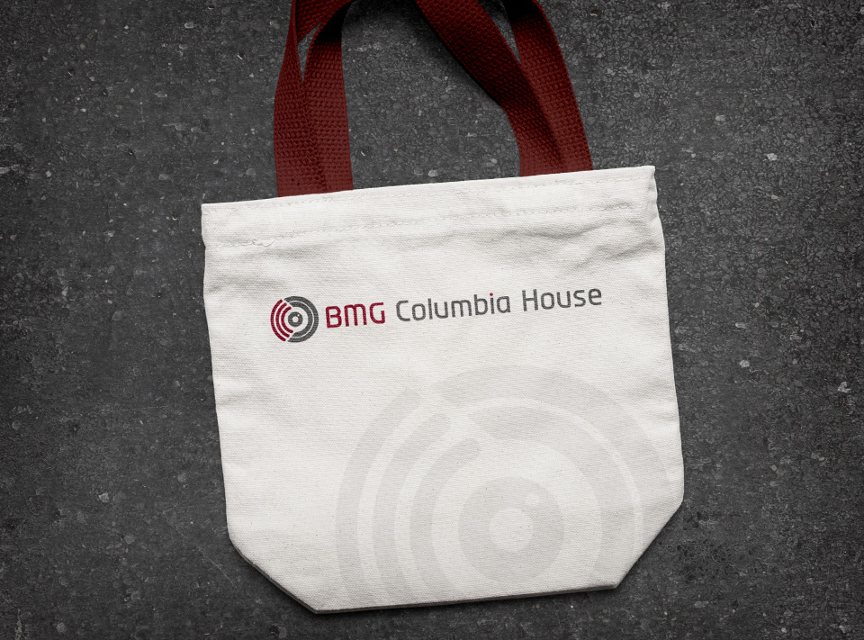
The main challenge of this corporate brand was to communicate the types of products we sold, CDs & DVDs. Since these two physical products look identical, I developed the icon to be a hybrid of both, incorporating an eye for sight (symbolizing DVDs, movies) and waves for sound (symbolizing CDs, music). I used a gray color palette to give a sense of stability to the brand while adding a pop of red to accents for interest. My goal was to create a clever, simple visual identity that was flexible enough to be strong, fun, and easily recognizable.
The main challenge of this corporate brand was to communicate the types of products we sold, CDs & DVDs. Since these two physical products look identical, I developed the icon to be a hybrid of both, incorporating an eye for sight (symbolizing DVDs, movies) and waves for sound (symbolizing CDs, music). I used a gray color palette to give a sense of stability to the brand while adding a pop of red to accents for interest. My goal was to create a clever, simple visual identity that was flexible enough to be strong, fun, and easily recognizable.
- Key roles
 Branding
 Logo Design
 Art Direction
 Stationery Design
 Merchandise
“

—Tina Cernero, VP, Creative, BMG Columbia House, Inc.
”
Logo development


Branding color palette & typography
Corporate stationery
Merchandise

 Hire Me Now
  Email
Email  917.836.5404
  Resumé
  Connect